Your iOS and Android Apps Are Supposed to Be the Same Product. One of Them Isn't.
Feature disparity between your platforms doesn't show up on any dashboard. It shows up in reviews that compare your app to itself — and in the churn of users who never knew what the other platform had.
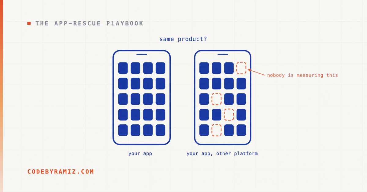
Somewhere in your reviews there's a one-star that isn't really about your app. It's about your other app — the review that points out the Android version can do something this one can't, or asks why the iPhone app is missing features its sibling has had for a year. Your user isn't comparing you to a competitor. They're comparing you to yourself, and you're losing.
If you ship on both platforms, you almost certainly have one real product and one approximation of it. That's not an accusation; it's close to a structural inevitability. One platform is where the founders live, where the first version shipped, where the team's instincts are. Features land there first, get refined there, and get ported — later, partially, by whoever's available. Nobody decides to build a worse product for half their audience. The gap accumulates one reasonable "we'll bring that over in the next release" at a time.
Here's what makes it expensive: the gap is invisible from the inside and obvious from the outside. Users on the weaker platform don't file tickets about features they've never seen — they just experience a thinner, clunkier product and quietly rate the whole company by it. The users who do see both — the ones who switched phones, the teams split across platforms — are the ones writing the reviews that compare your app to itself. Meanwhile there is no dashboard for this. Crash rates won't show it. Analytics won't show it, because you can't measure engagement with a screen that doesn't exist. Parity is nobody's number, so it degrades without anyone being paged.
I recently took a production Android lead-management app to iOS — the full surface, not a starter subset — and the process taught me more about platform disparity than a decade of hearing "the iOS app is a bit behind" ever did. Not because porting is novel, but because doing it accountably forces you to confront exactly the failure modes that create neglected twins in the first place. Three of them are worth walking through.
First: you cannot close a gap you can't enumerate
Before any of the interesting failures, the unglamorous prerequisite. Ask a team how far behind their weaker platform is and you'll get an adjective — "a bit", "somewhat", "we're catching up." Adjectives are how gaps survive. The only useful answer is a list.
So the audit that governed this port was built adversarially: walk the Android app's actual navigation source and enumerate every destination it can reach — which produced 25 screens plus 7 modal sheets that weren't registered as screens at all — then, independently, walk the iOS codebase and prove where each one lands. Fresh scan, no reading the previous audit's conclusions, precisely so it can catch the previous audit being wrong. With cross-cutting systems (deep links, notifications, billing, share intake), the final table came to 42 rows.
A handful of rows, so the shape is concrete rather than asserted:
| Surface | iOS status | The proof the row demanded |
|---|---|---|
| Daily board (primary tab) | Present and wired | Reachable from tab root, light + dark |
| Templates workspace | Deliberately adapted | Promoted to a first-class tab; screenshot of the tab root |
| Lead filters (segment × label) | Present and wired | Both active at once returns the AND-set, with named seed data |
| Push notifications | Wired but unproven on hardware | Delivery confirmed on a real device, not the simulator |
| A–Z index rail | Deliberately adapted | Native primitive; five visibility gates, each tested |
| Exact-alarm permission banner | Deliberately adapted (Android-only) | None — a documented platform difference |
An illustrative excerpt of the 42-row ledger. The point isn't the rows — it's that every row carries a status from a fixed vocabulary and a named proof, so "done" can't be asserted, only shown.
The audit's real contribution wasn't the count. It was refusing to answer "is this feature there?" with yes or no. Every row got one of five statuses: present and wired, partial, missing, deliberately adapted, or — the one most teams don't have a word for — wired but unproven on real hardware. That last category matters more than it looks: on the final pass, zero rows were missing and zero were partial, but nine were still "code exists, hardware hasn't proven it." A team without that vocabulary reports those nine rows as done. Then the twin ships, and notifications or purchases or the share sheet quietly don't work, and the platform earns its reputation one unproven row at a time.
The honest beat in this story: an earlier pass of my own project had marked screens "implemented" that a user couldn't actually reach — the code existed, the tests passed, and there was no path to the screen from the app's real navigation shell. The audit rule that came out of it is now written at the top of the parity table: a row may not be marked implemented unless the screen is reachable from the declared shell. Which brings us to the first failure class.
The workspace that was technically there and practically buried
Every screen of the iOS app existed. Screen-by-screen review: fine. And it was still a worse product than its Android twin, structurally, in a way no per-screen checklist could see.
The Android app's bottom navigation makes its three primary workspaces — the daily board, the lead list, and message templates — each one tap away, with settings pushed off to a toolbar icon. The iOS build had drifted into a different shell: settings held a primary tab, and the templates workspace — a thing users touch constantly, because it's where reusable outreach messages live — was demoted to a row inside settings. Two taps deep, in the place users are taught nothing important lives.
No feature was missing. A checklist auditing "does the templates screen exist?" passes. But a workspace's rank in the navigation is a feature — arguably the feature, because it encodes what the product thinks you do all day. The fix was a shell reset: templates promoted to a first-class tab, settings demoted to a pushed screen, and — because of the earlier lesson — the change wasn't accepted on the strength of the code existing, but on screenshot proof that each tab root was reachable, in both light and dark mode.
The principle, and it generalises to every neglected twin I've seen: feature parity audits fail when they audit screens instead of structure. An app can contain 100% of its sibling's features and still be the worse product, because containment isn't access. If your weaker platform "has everything" and still gets worse reviews, look at its shell before you look at its screens.
The filter that could have quietly meant something else
The second failure class is the one that scares me most, because no screenshot can catch it.
The Android app's lead list has two filter dimensions: a status segment ("no follow-up yet", "has follow-up", "recently added") and user-defined labels. Android renders both as chips in one combined row, and — this is the load-bearing detail — selecting a segment and a label narrows the list to leads matching both. The filters compose with AND. A sales user relies on exactly that: show me VIP-labelled leads I haven't scheduled a follow-up for is the query that decides what they do next.
On iOS, cloning Android's single combined chip row would have been the lazy kind of faithful — it reads as Material design transplanted onto an iPhone. The native expression was two separate filter rows. But the moment you split one control into two, you've created the opportunity for a semantic drift: two independent-looking filters that a reasonable implementer wires as either/or, or as last-one-wins. The screens would look right. Every individual filter would work. Demo: flawless. And the one query the power user actually depends on would silently return the wrong set — the kind of platform disparity no one ever files a bug about, because who on the team runs that exact combination on the twin?
The load-bearing claim, made inspectable — the one query the power user depends on, and the rule that makes it correct:
// "Show me VIP-labelled leads I haven't scheduled a follow-up for."
// Parity requires the two filters compose with AND —
// not last-one-wins, not OR.
visible = leads.filter { lead ->
    segmentMatches(lead, activeSegment) && labelMatches(lead, activeLabels)
}
The accepted proof wasn't "the filters look right." It was a screenshot of one segment and one label active together, returning the two seeded leads that satisfy both — proving AND, not OR, with named data.
So that behaviour got pinned explicitly. The parity table's row for this doesn't say "filters look right" — it requires that segment and label filtering combine with AND, marks the split into two rows as a deliberate divergence from Android's combined row, and the accepted proof is a screenshot of a label and a segment active simultaneously with the two seeded test leads that satisfy both — proving AND, not OR, with named data. The first review round also rejected the split rows for reading as one filter, which produced separate captions for the two dimensions, so the structure divergence is legible to the user too.
Parity is a property of outcomes, not layouts. The dangerous gap between your platforms isn't the screen that's missing — you'll hear about that one eventually. It's the control that exists on both and means something subtly different on each. Those never get reported. They just make one platform's users trust the product a little less, without being able to say why.
The feature with no native equivalent — and the rewrite I refused
The third class: the Android feature that iOS simply doesn't have a matching part for.
Long, name-sorted lead lists on Android get an A–Z index rail — tap or drag on the letter strip at the right edge and the list jumps. iOS users know this pattern from Contacts, so its absence on the twin would be felt immediately. The catch: the modern declarative iOS UI framework doesn't expose the classic system contacts-list index. Reaching the native one means dropping down to the older imperative toolkit and wrapping it — which, in this codebase, would have meant rewriting an entire already-approved, already-proven list screen (custom row chrome, selection states, filter integration) just to acquire a letter strip.
That's the moment where platform disparity usually wins. The tempting rewrite is big and risky, so the feature gets tagged "iOS limitation" and dropped — one more row in the invisible ledger of ways the twin is lesser. The other failure is just as common: do the big rewrite, break subtle things in a screen that previously worked, and spend the next month re-earning what you already had.
The path that shipped was narrower than either: keep the existing screen, use the framework's native pinned-section-header primitive for the sticky letter sections, and build the rail itself as a small custom control driving the framework's own scroll targeting — with Android's exact behavioural contract carried over rather than approximated. Same bucketing rules, down to folding accented characters onto their base letter and collecting non-alphabetic names into a trailing "#" bucket. Same five visibility conditions, carried over as a contract rather than approximated:
// A jump rail over a filtered list jumps to the wrong places,
// so it appears only when ALL five hold. Each gate has its own test.
showIndexRail =
    listIsUnfiltered &&
    listIsUnsearched &&
    notInSelectionMode &&
    sortedByName &&
    hasEnoughRowsToScroll
Android's behavioural contract, made legible — the five gates the rail must respect. A jump rail over a filtered list jumps to the wrong places, which is why each gate is a condition, and each condition is a test.
"The platform can't do it" is almost never true; "the platform can't do it cheaply" often is — and that's a decision, not a fact. When a feature matters on the strong platform, the twin needs either the feature or a written, deliberate reason it's absent. What it can't have is an accidental absence that hardens into policy because nobody priced the narrow path.
The differences that should stay
One more category, because closing a gap isn't the same as cloning an app. Some rows in the parity table are marked as accepted differences — Android surfaces exact-alarm permission toggles and manufacturer auto-start warnings because Android's background-execution model requires them; iOS has no such concepts, and porting the banners would mean inventing UI for problems the platform doesn't have. Sheets where Android pushes full screens. A share-sheet intake flow instead of Android's text-selection menu.
The point isn't which differences are correct. It's that a deliberate difference and a neglected gap are indistinguishable unless someone wrote the decision down. Six months from now, "iOS doesn't show alarm warnings" is either a documented platform adaptation or the start of a mystery, and the only thing that decides which is whether the ledger exists.
Four questions for the platform you're worried about
- Can anyone produce the list? Every screen, sheet, and flow the strong platform has, with the weaker platform's answer for each — present, partial, missing, adapted, or unproven on hardware. If the answer is an adjective, the gap is bigger than anyone thinks.
- Does the weaker app's structure match what users do all day — or did its navigation drift while the screens stayed technically present?
- For every control that exists on both platforms — does it provably mean the same thing? Filters, sorting, defaults, what "delete" cascades to. Screenshots won't answer this; only paired behavioural proof will.
- Which differences are decisions, and where are they written down? Anything that can't be traced to a decision is a gap with good PR.
If your two apps are supposed to be one product and everybody quietly knows they aren't — that's a rescueable condition, not a rewrite sentence. The method above is the kind of work I get called in for: enumerate the real gap adversarially, close it in proof-gated slices, and leave behind the parity ledger so the twin never drifts silently again. And if the weaker platform hasn't shipped in a long time either, that's its own diagnosable pattern.
Ramiz Raja is a senior mobile developer and technical lead with 12+ years shipping and rescuing production apps on Android, iOS, and Flutter. More at codebyramiz.com.